I have my first assignment due this week for photography class!
Part of me is saying: Yay!!
The other part of me says: "Oh, CRAP!"
Our assignment is this: Take 5 photos of something that interests you.
Pretty broad, wouldn't you say. There are limitations, such as: no pictures of children, spouses, anyone else's art, cows, and ducks.
Apparently my instructor has seen one too many farm animals.
Today I took my first photo intended for class exhibition. But, I need your help. I have 4 photos of the same subject but each with a different angle. I want to know: which do you like best? If you want to tell me why, please do! If you just want to vote, please use either: 1, 2, 3, or 4 in your comment.
Also, I am open to constructive criticism of my photo. But, please be nice; I am learning, okay. Love you.
Here we go!
#1
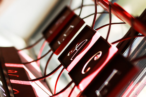
#2

#3
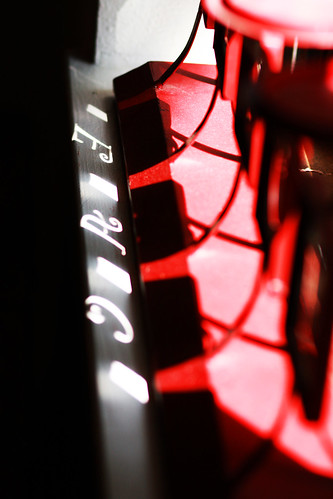
#4
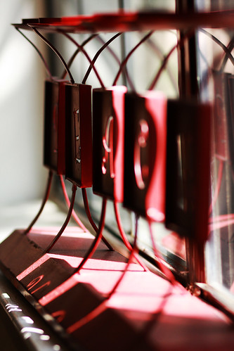
P.S. I think the dust adds interest. There is even a spider web for the really nosy ones.
Good bye.
Part of me is saying: Yay!!
The other part of me says: "Oh, CRAP!"
Our assignment is this: Take 5 photos of something that interests you.
Pretty broad, wouldn't you say. There are limitations, such as: no pictures of children, spouses, anyone else's art, cows, and ducks.
Apparently my instructor has seen one too many farm animals.
Today I took my first photo intended for class exhibition. But, I need your help. I have 4 photos of the same subject but each with a different angle. I want to know: which do you like best? If you want to tell me why, please do! If you just want to vote, please use either: 1, 2, 3, or 4 in your comment.
Also, I am open to constructive criticism of my photo. But, please be nice; I am learning, okay. Love you.
Here we go!
#1

#2

#3

#4

P.S. I think the dust adds interest. There is even a spider web for the really nosy ones.
Good bye.





49 Comments:
#1....they are all great though.
Oooh fun! I like #1 and #4 the best.
1 & 4
I like off kilter and the reflection in 4.
I like #1 visually the best, but could not tell what it was until #4.
#1 or #4. Looks like those are the popular ones so far.
#1 is my fave...it's just an interesting angle.
#2 is my least fave
I like #1.
I like four for the relection and angle.
they're all cool... but something about # 3 really pops.
good luck! I would love to take a photography class one day. Sounds like fun. :)
britt
I really like #1.
Andrea,
I am in love with #1 but there is something about #3 that also catches my eye. BUt I really think I'm leaning towards #1.
#4 caught my eye, but I have to say, what is it? I'm clueless!
They're really good pictures! I love the colors and how you were able to capture the colors. Number one is definitely my favorite, but they're all great! Good job!
As a whole, I think that I prefer #1. Something about the way the light is playing in it. On a more specific level, I LOVE the letters in the shadow of #3. If you could read the whole word, I think that one would easily be my favorite.
love 1 & 4 - I think if I have to narrow it down I would say 4.
Despite my slight obsession with diagonals, I think the composition of #2 has the most visual interest - particularly in the high contrast between the white, black and red...I feel as though the light gives the red elements a higher degree of saturation. It looks like a jewel tone...beautiful!
I really like #3 - I like how the letters come through in the shadow.
I vote for #1 (#4 comes in a close second). I do like the light shining through the letters in #3, but I really like the angles in 1 / 4.
Good luck!
I like #1 :)
I think they are all very cool but I like the 1st one the best. :)
#1 because I can tell what I'm seeing. The others made me squint to see if I could read it. I like the fact that it's more than one "I like" - you could like the object, the peace, or the red. Haha. Red? Really?
But I don't know much about composition, so it's based simply on that fact that I can see what it is.
#1 -- And I picked that before reading the other comments!! LOL.. Just the most eye appealing.
I like #1. The angles of all of them are really interesting, but you can only read the whole word in the first one, so that's my favorite. If I could read "PEACE" in the shadows on the others, I'd choose differently. :-)
I'm also going to say #1.
I like it because you can see the entire word peace but the photo was at a good angle.
#3 is my favorite, followed closely by #1...they're all cool shots, though. it's fun to see the different shots you can take of a single subject!
good luck!
--tamara
I like #3.
I am torn between 1 & 3 - 1 because you can see more of what the object is, but 3 because I love the angle of the object and clarity of the shadow...it's unique. Hope you do great!
#2, i love the way the light shows the letters, that looks so awesome!
I seem to be in the minority, but #2 is my favorite. It's impossible to tell what it is, which makes it all the more intriguing.
#1 is my favorite, I like the angle on it the best.
Oh..and I'm making your famous chocolate chip cookies this afternoon. I can't wait to try them!
I'm going to have to be a sheep and say #1 :) I like how you can read what it says! Great skills! :)
I vote for #1 too because it has a focal point. The others are very cool angles, but don't have a specific point that you want to draw my eye to. So #1 for me.
I LOVE them all but I think #1 is my favorite! Good luck with your class!
I say #1 as well! They are all great, but that one stands out :)
I am torn between #1 and #3...I just love the light in #3!
#1 b/c you can read the words the best but they are all cool shots! Good job.
I really enjoy # 3 and the way the light shines through and displays the letters on the sill. My only question is: Is and angle or time of day where you could capture the whole word?
Great pictures Andi!
3, if you had not seen the other photos you would still be trying to figure out what it was and how the letters got on the windowsill.
Fab!
Amanda
I like #1 b/c you can tell more of what you're looking at, but all the different angles are really cool. You're so good.
#1, i like that one best, good job
#3 is awesome how the letters show through, I really like that!
as far as any constructive criticism goes, I would say maybe try playing with the aperature a bit. I am a HUGE fan of large aperatures, but in this case it's kinda hard to get a clear picture of what it is exactly. It's just a suggestion though :) you can always play and then go back!
definitely #1!
i would say #1 if it was and art photo, but #4 if it was representative photo. Good luck with picking up the best one. :)
i like #1 the best
I pick numero uno! :)
I must be the odd man out because something about #3 is catching my eye. I also like #1 a lot:)
Nicely shot, Andrea! I like them all, but #1 is at the top of my list.
I like #1 best, I think it has the most visual interest.
Your subject has straight lines (whole thing is horizontal rectangle and each letter is cut out of another rectangle) so to catch it on the diagonal is waaay more interesting than a straight shot. Also, the focus is sharp on the "A" with almost equal blurring towards the front and back. It lends a unique feel to the photo and piques the viewers interest to figure out what the item says. Even though you can't see the shapes cast on the windowsill by the sunlight going through each letter, it is nice that you were able to capture some in this shot. Lots of elements working together to give it a "modern art" feel. Nice work!
I like #1 because it is the clearest. The others seem a little fuzzy.
Plus, what is it?
Post a Comment
Home